-
Architects: Piuarch
- Area: 900 m²
- Year: 2015
-
Photographs:Andrea Martiradonna
-
Manufacturers: Serge Ferrari

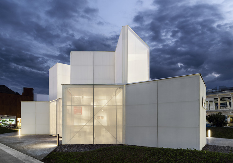
Text description provided by the architects. Designed for the Expo 2015 area in Milan, the Caritas Pavilion is based around the message: “Divide to multiply. Break the bread” or, in other words, the idea of sharing wealth. The Edicola, this is the name of the small pavilion, has the appearance of a fragmented cube that translates into architectural terms the idea of crating wealth by sharing. The structure has been designed keeping simplicity at the core of its composition and the unadorned nature of its appearance.

The project is divided into 5 structures that are similar to each other but of different sizes and designed for different purposes. They are positioned on the ground and joined by vertices, a reference to the Edicola’s typical square floor plan. The uniformity of the construction is provided by its structural profile characterized by the same external dimensions, colour and materials.

Thanks to its extremely simple structure, the Edicola is truly eco-sustainable. Externally, It is made of plastic pretensioned mesh that lets the air flow through without any need for air conditioning and lets in natural light which helps keep energy use to a minimum. Moreover, the structure has been designed ensuring that it can be efficiently dismantled and re-assembled elsewhere. Thanks to its shape, structure and dimension, it can be used as a school, a counseling centre for the disadvantaged or a centre from which to provide basic life support to the needy.

The plot occupied by Caritas, placed in a strategic position along the Decumano of the Expo 2015 site, presents a number of different features: a 200 sqm outdoor paved area that greets visitors, a 150 sqm covered area divided into different rooms and a 550 sqm green area. It is not just a place but 5 situations, 5 experiences that helped visitors relate to the theme “divide to multiply” and the Caritas world. Visitors moved through the five “rooms” overlooking one single central area. An artwork entitled Energia, designed by the German artist Wolf Vostell in 1973, was the main attraction in this space. Energia is a large installation with great narrative force constructed out of a Cadillac loaded with war weapons surrounded by different kinds of bread. This powerful critique of consumer society comes from the contrast between symbols of consumerism and destruction and man’s primary need, bread.


